Creation of this typeface for titling, display, and logos was inspired by my exploration and drawing of forms found in nature. Refined, quiet and elegant, yet quirky enough to employ slim filaments that somehow are not faint of heart, Mandevilla is named for the verdant tropical vine. The sturdy plant has firm footing in the soil, then climbs, curving around trees, stretching toward the light, bridging earth and sky. Mandevilla began as a sans-serif, but its footing, in the form of tiny round lachrymal terminals, roots it and transforms it into a semi-serif. From there the tendrils spiral—especially in the uppercase letters, with their echoes of nautilus shells we held to our ears to hear the ocean—and embrace slender, airy ascenders that tenderly but determinedly rise heavenward. As I sketched, I played with curliques, beginning with the uppercase A. My process usually begins with lowercase letters, but I was fascinated by the spirals and the references to nature, and how that swirl swept around the A, B, and Q, giving each a delicately different personality, within a softly stated whole. The sweep of my pencil both interrupted and completed the diagonal stems of the A and the K, and this idiosyncrasy intrigued me. How would this theme work its way through the alphabet? When I was finished, I sensed spun sugar, or the vines of a delicate plant—and thus its name, Mandevilla. From there, I moved to the lowercase letters, and sought simplicity to balance the embellishments in the uppercase letters. Round, open, friendly, warm, with just a whisper of the Art Deco period, they soften the more ornate letters yet confer a touch of clarity. Born as sans-serif shapes, their terminals now carry a hint of drops of dew, shifting them to semi-serifs. Alternates are included to allow for versatility, so each design has your unique twist. While the Mandevilla default is decorative, the titling set is unadorned and non-stylized, yet still capturing the airiness of the typeface. Access them in the Open Type panel as Titling Alternates, as seen in the User’s Guide. They’re useful in some larger text settings or simply if the design calls for a more standard look. Also included are a 3/4 size set, listed and found as small caps. Small caps are typically the size of a lowercase letter, but these 3/4 caps are about 80% of the height of the uppercase letters. They are useful for all uppercase settings—used together, they maintain a sense of a word shape because they are smaller and less ornamented than the initial cap and are serif-free. A set of swashes offers both upper and lowercase variations, with an especially rich selection for each lowercase letter. Mandevilla includes a downloadable User’s Guide (available for download from the ‘Gallery’ tab), 950 glyphs, and 210 alternates, including sets of uppercase and lowercase letters (both swash and standard—the standard are listed in the User’s Guide as “Titling Alternates”), and 3/4 uppercase alternates listed as “small caps.” Thirty-eight ornaments complete the package. May your type rise up to meet you as you work!
OTF | 3 Fonts | JPEG Preview | 9.4 Mb RAR
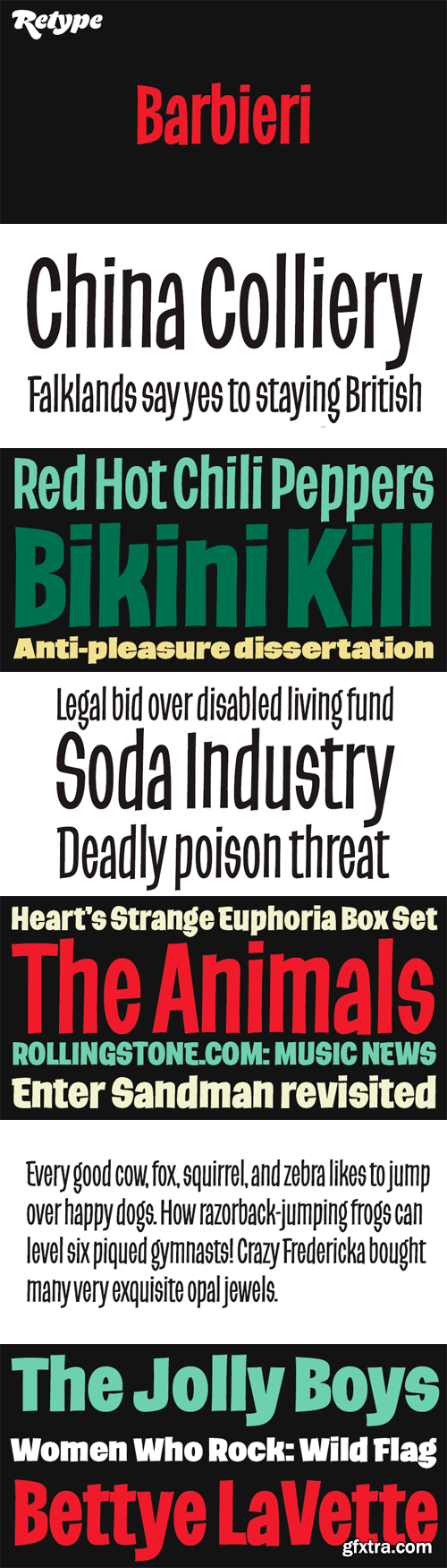
Barbieri is a casual sans type family, based on a German lettering style from the 1960s. The original hand-drawn alphabet was used in a rather peculiar edition of Der Barbier von Bagdad, an opera composed by Peter Cornelius. Our efforts to identify the cover designer have been, so far, unsuccessful. As fans of informal typography and popular lettering styles, we thought these few thin letters deserved a re-incarnation as a complete type family. Andrés Torresi and Marta Sánchez Marco were in charge of the production work. Now Barbieri has 6 weights suitable for packaging, posters, and music covers. It resembles a certain ‘Americana’ spirit, though with a Germanic twist.
OTF | 6 Fonts | 3.7 Mb RAR
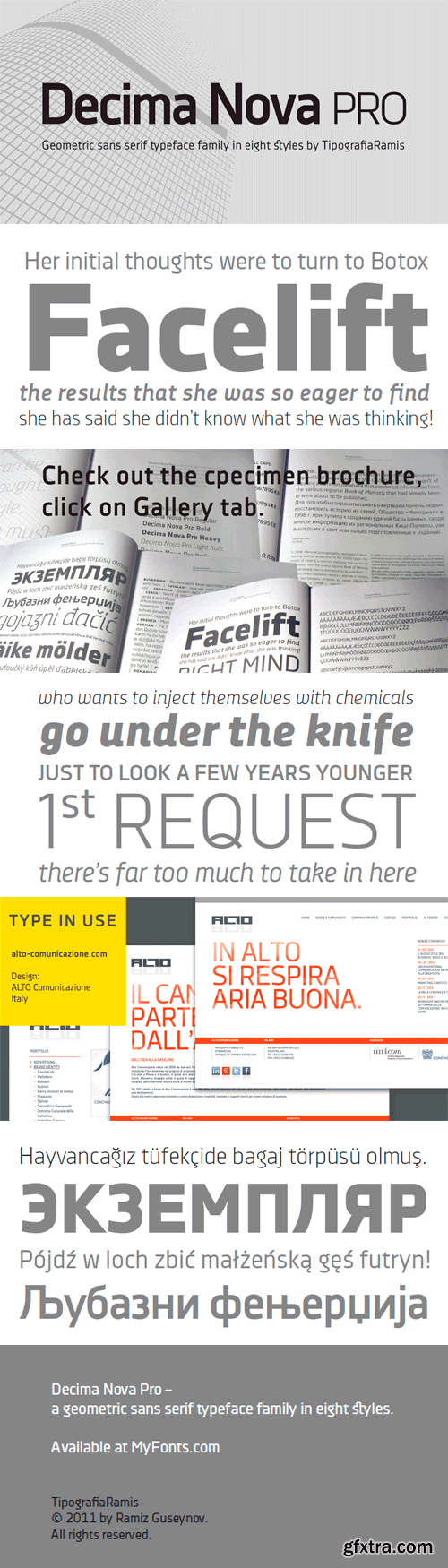
Decima Nova Pro is a geometric sans serif typeface family, built in eight styles. The typeface is ideal for use in display sizes, but also is quite legible in text and is well suited for editorial and brand design. Features include extended language support, small caps, multiple numeral styles, slashed zero, ligatures. Decima Nova Pro is released as font family in OpenType format with a Latin Western 1252, Eastern European 1250, Baltic 1257, Turkish 1254 and Cyrillic 1251 character set.
OTF | 8 Fonts | JPEG Preview | 3.4 Mb RAR
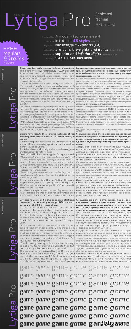
Lytiga Pro is a modern sans-serif typeface with a pronounced techy feel. The family contains 48 fonts: 8 weights from thin to black, 3 widths, and italics. Each font includes a variety of OpenType features: four sets of digits, superior and inferior digits, slashed zero, and a full set of small caps. Rich language support includes all the main Latin-based languages as well as Cyrillic script. The rhythm and character of the typeface makes it suitable for both display and text use.
OTF | 48 Fontrs | JPEG Preview | 4.8 Mb RAR
PF Din Text Universal Font Family
DIN Text Universal is the most advanced DIN superfamily ever. It combines the powerful DIN Text Pro with DIN Text Arabic bringing the number of glyphs to 3320 per font. In fact, this set of fonts contains the most complete and powerful array of arabic features commercially available. It supports all variations of the Arabic script such as Persian, Urdu and Pashto. It is also enhanced with 30 advanced opentype features and kerning for all languages. The four major scripts Latin, Arabic, Cyrillic and Greek are now matched across the design of the whole family, respecting at the same time each one’s modern cultural identity. With its vast array of weights, the extended support for numerous languages, its careful and detailed design, it will prove to be extremely valuable for many complex corporate projects and corporations which operate internationally.
OTF | 8 Fonts | JPEG Preview | 4.1 Mb RAR
This is a complex typographic system which includes three different but complementary styles so far: Slab, italic and script, with nine weights each one; plus three sets of ornamental fonts: labels, negative labels and ornaments. The soul of the family is a slab feeling applied judiciously to the italic and script styles to make it coherent with the whole system.
Each style has three sets of figures: Proportional lining, tabular lining and old style. You can mix the three styles in a single piece to obtain more expressive results without worring about the uniformity and complementing the design by using the ornamental sets.
OTF | 30 Fonts | JPEG Preview | 12 Mb RAR
- Axia is a robust sans serif of concise letter forms. It comes in ten weights from Light to Black with extended language support, a host of OpenType features including Small Caps, multiple figure styles, and more. Each, the roman and italic weights harmonize perfectly in line width. Text set in Light or Black results in the same fit. Stencil display weights with a unique aesthetic and perfect for captivating type sizes add further distinctive options to the typographic palette. The stencil display weights consist of abstract floating parts that seduce the eye and form nicely proportioned type when united. Originally designed for the Rice University School of Architecture in 2011, this contemporary sans found some inspiration in the TwinCities™ typeface family created by Sibylle Hagmann for the University of Minnesota in 2003. Orchestrated from scratch, the inner arched strokes off the stem on the lowercases ‘n’ or ‘d’, for example, progressively open the letter forms and express conceptual clarity throughout the system. A feature doing double duty that contributes to great legibility in the heavier weights and attributes to the versatility of individual weights.
10 OTF | JPEG Preview | 4.2 Mb RAR
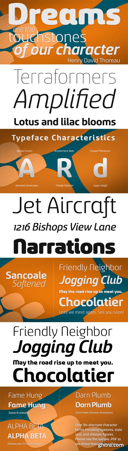
Sancoale Softened is the new rounded companion to Sancoale. While the original Sancoale is crisp and defined, its delicate forms also lend themselves well to a lighter, more rounded version. The stems of Sancoale Softened are blunted, and its corners have been carefully rounded, avoiding the “sausage” look seen with some rounded fonts.
This blend of definition and delicacy makes the Sancoale Superfamily versatile and appropriate for a variety of applications. The design minimizes the characters to their essence, leaving a default set of simple characters without notches or spurs. However, the typeface family’s slightly technological feel still appears friendly and approachable to the reader. It’s slightly condensed proportions and tall x-height also make the design readable at a wide range of sizes, which works especially well for web pages. These softer letterforms give Softened its unique, futuristic look--great for distinguishing your text or display. There are six weights with true italics. All insigne fonts are fully loaded with OpenType features. Sancoale Softened is also equipped for complex professional typography, including alternates with stems, small caps and plenty of alts, including “normalized” capitals and lowercase letters. The face includes a number of numeral sets, including fractions, old-style and lining figures with superiors and inferiors. OpenType capable applications such as Quark or the Adobe suite can take full advantage of automatically replacing ligatures and alternates. You can find these features demonstrated in the .pdf brochure. The Sancoale family also includes the glyphs to support a wide range of languages, including Central, Eastern and Western European languages. In all, Sancoale Softened supports over 40 languages that use the extended Latin script, making the new addition a great choice for multi-lingual publications and packaging. Sancoale Softened continues with Sancoale’s successfully simple, geometric and legible structure. With its suitability for a wide range of uses, the Sancoale superfamily is a very economical and versatile addition to any designer’s font collection.
OTF | 12 Fonts | JPEG Preview | 3.9 Mb RAR
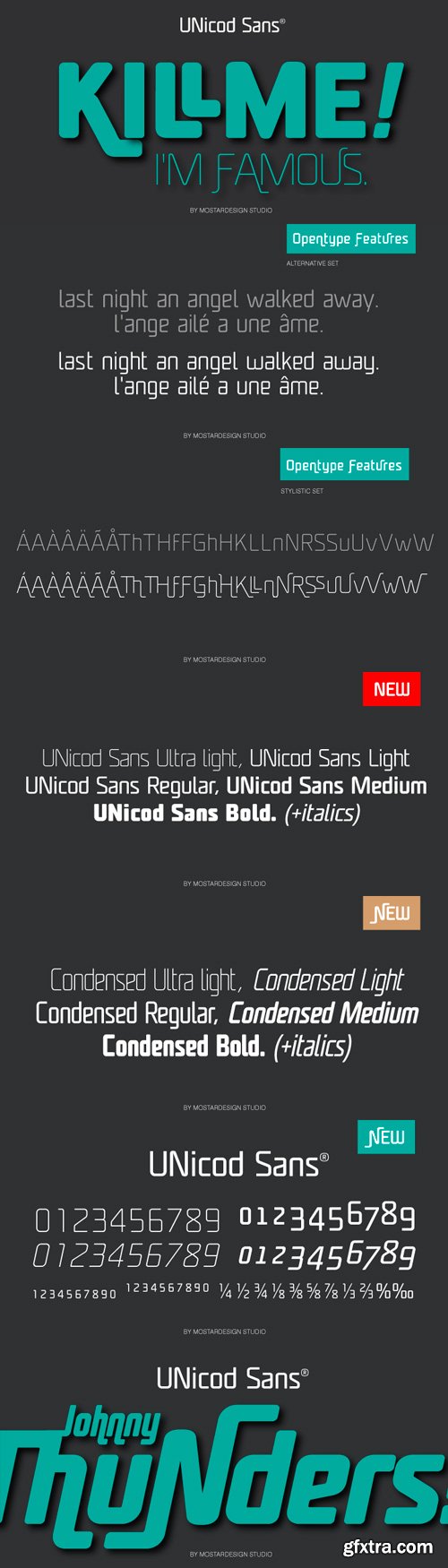
This font has been especially designed for Mostardesign Studio by Olivier Gourvat. Created in 2010, this font family has been designed to serve sectors like financial services, modern industries, business and many more activities who needs a modern aspect in their communication. Its square proportions make the design very readable at a wide range of sizes. Shapes give the face a unique futuristic look and is a very practical choice for modern headlines, branding, text and web fonts work. The family contains also an alternative set with simplified letters designed especially for text and a unique stylistic set for titles and branding. UNicod Sans is available in 5 weights with corresponding italics and 2 styles.
TTF | 18 Fonts | JPEG Preview | 4.8 Mb RAR
PF Regal Finesse Pro Font Family
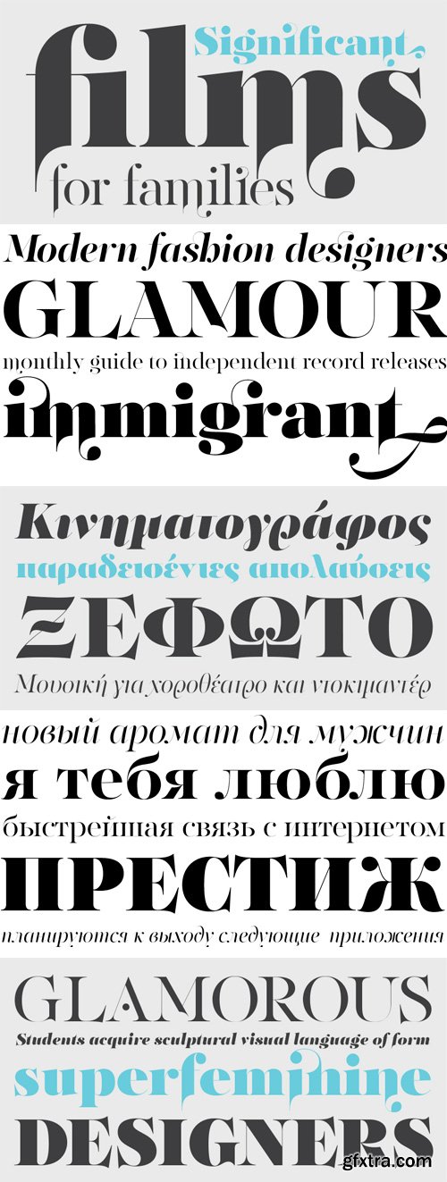
The objective of this project was to design a new typeface series for Grazia magazine. First published in 2010, Regal was later revamped and redesigned for commercial use, evolving into a type system with five related superfamilies. According to the brief, this typeface had to be elegant, luxurious, sexy, vibrant, reflect the female sensitivity and take into consideration a modern woman who is more proud, more connected, more spontaneous, open-minded and eager to try a whole host of new products and services. Targeting this consumption-wise and well-educated woman, required a typeface that is not strictly based on classic forms, but incorporates several distinct elements that express a modern woman’s personality and the products she consumes. In that respect, a whole series of 5 related superfamilies was designed, which not only emphasize femininity but also reflect both the romantic as well as the dynamic side of the female personality. For that matter, elegant curvy details were introduced in order to create a link to the female figure; teardrop terminals which reflect a woman’s sensitivity; pronounced quirks on upper and lower arms for her eyelashes; high-contrast, sharp corners at thinning terminals for her high heels; alternate glyphs for the woman who prefers to express her individuality -rather than slavishly follow trends- by using various accessories which can dramatically change her appearance; elegant endings and long curves to reflect her predisposition to dream; bell-shaped serifs with an inward rather than outward direction which recall streamlined seventies fashion. This series of typefaces is diverse in its construction as it consists of five related superfamilies i.e. text, display, finesse, swash and stencil. There is a variety of weights which range from regular to ultra black for each one of the five families. These families share common attributes but they differ in content according to each one’s usage. The whole superfamily type system is comprised of 47 weights with an average of 898 glyphs per weight. It supports simultaneously Latin, Cyrillic and Greek and comes with many alternate glyphs.
OTF | 10 Fonts | JPEG Preview | 5.5 Mb RAR
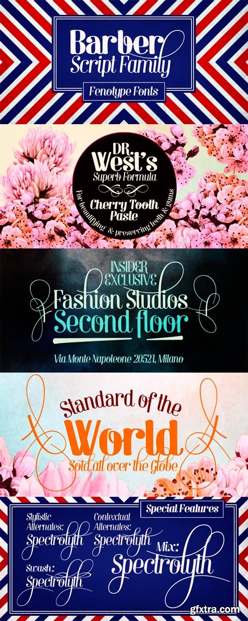
Barber is a versatile script font family with four weights. While Barber 1 is elegant and neat Barber 4 is cheerful, strong and full of warmth. Barber works great by just typing words but for some extra kick try turning on Contextual Alternates, Swash or Stylistic Alternates in any Opentype savvy program. By opening Glyph palette you'll also find an useful selection of ornaments.
OTF | 8 Fonts | JPEG Preview | 4.1 Mb RAR
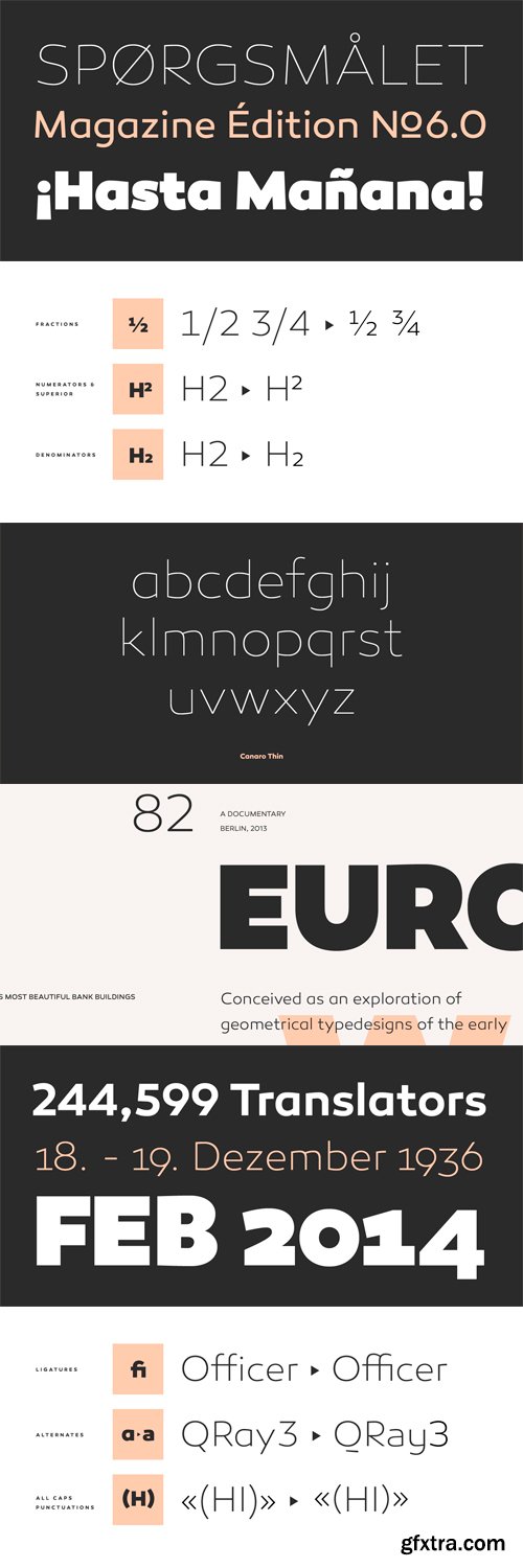
Conceived as an exploration of geometrical typedesigns of the early 20th century, Canaro developed into a font of that period with a modern streak. The lack of spurs provide a unique but unobtrusive appearance and support the contemporary character. In addition, the open shapes in combination with a tall x-height, create legibility in small text sizes. Typographic features like alternative lettershapes, ligatures, oldstyle numbers, arrows, fractions, special characters and many more, round up the whole family. Canaro is available in nine weights plus matching italics. Ranging from sharp and elegant thinner cuts to sporty and athletic heavy weights.
OTF | 18 Fonts | JPEG Preview | 5.6 Mb RAR
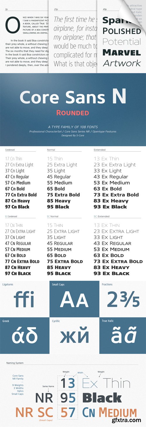
The Core Sans NR Family is a part of the Core Sans Series, such as Core Sans N, Core Sans N SC, Core Sans M, and Core Sans G. This family is the rounded version of Core Sans N family. Letters in the Core Sans NR Family are designed with genuine neo-grotesque and neutral shapes without any decorative distractions. The spaces between individual letter forms are precisely adjusted to create the perfect typesetting. The Core Sans NR Family consists of 3 widths (Condensed, Normal, Extended), 9 weights (Thin, ExtraLight, Light, Regular, Medium, Bold, ExtraBold, Heavy, Black), and Italics for each format. It also supports WGL4, which provides a wide range of character sets (CE, Greek, Cyrillic and Eastern European characters). Each font includes support for Superiors and Inferiors, Fractions, Tabular numbers, Arrows, Box drawings, Geometric shapes, Block elements, Mathematical operators, Miscellaneous symbols and Opentype Features such as Proportional Figures, Tabular Figures, Numerators, Denominators, Superscript, Scientific Inferiors, Subscript, Fractions and Standard Ligatures. We highly recommend it for use in books, web pages, screen displays, and so on.
OTF | 108 Fonts | JPEG Preview | 18.5 Mb RAR
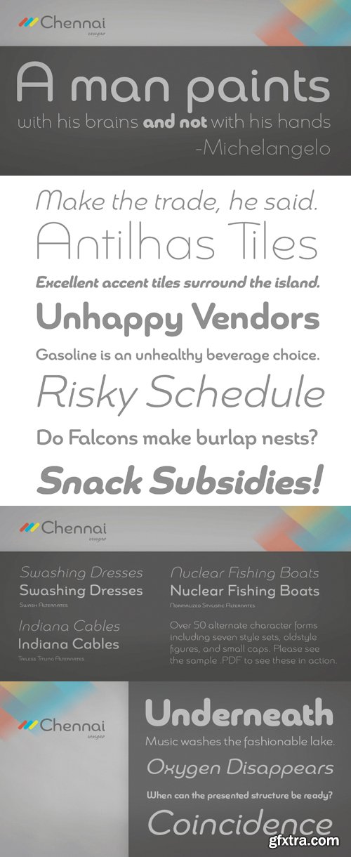
Updated in 2009, Chennai has new weights and OpenType features. Chennai is a simplified sans-serif with a full complement of OpenType alternates. The typeface is rounded, slightly extended and geometric. Over fifty OpenType alternate characters are available, including swashed lower forms, traditional caps and a traditionally formed lowercase. Chennai also includes seven style sets, oldstyle figures, and small caps. Please see the sample PDF to see these in action. Use Chennai whenever you need a contemporary and versatile sans serif.
OTF | 6 Fonts | JPEG Preview | 4.7 Mb RAR
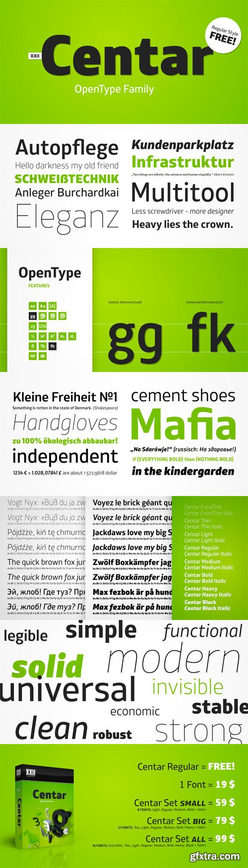
Centar Sans is a simple, modern, universal, powerful, invisible but not characterless, sans serif family. The family is designed for identities & corporate projects. Its wide range of styles covers lots of possibilities of use, from headlines to texts. It supports a lot of languages including cyrillic and comes along with 19 OpenType features - Small Caps, ligatures, alternates and many more.
OTF | 16 Fonts | JPEG Preview | 3.9 Mb RAR
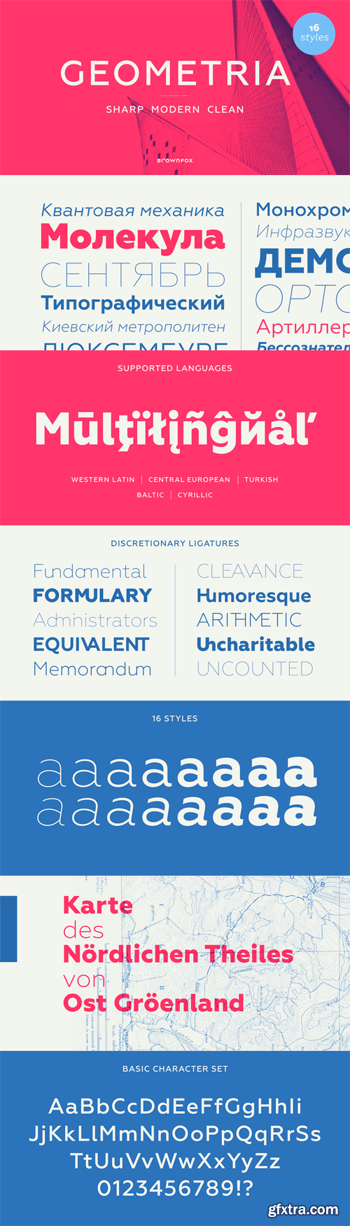
Geometria is a new geometric sans serif. It consists of 16 fonts - eight weights with matching italics. The font includes multiple sets of figures and currency signs, alternate glyphs, a variety of experimental ligatures, and punctuation marks for the two cases. The 815 glyphs support 71 languages. Although geometric Sans Serifs have been in vogue for nearly a century, they have never been as ubiquitous. It is not improbable that the old adage would be phrased: "When in doubt, set it in geometric sans", had it been composed today. Have we not had enough? We think, not. Postmodern times demand a variety of expressions. The vision behind Geometria was to revisit the perennial favourite to lend subtle individuality to its tried and true forms. Geometria stands out in the crowd of similar fonts thanks to its complicated nature. It combines dynamic elements with a certain degree of stability. A slightly higher waistline of the capitals contributes to their distinctive appearance. If the upper case refers to the American grotesques of the 19th century, the lower case tends toward the forms of the Renaissance in its proportions. Geometria is a typeface of clean shapes that is well-suited for continuous reading, and it sets remarkably well. At the same time, it can be friendly, even flirtatious. Its distinct personality combines seeming opposites. At times it may appear serious, at times playful. On occasion, it may be deliberate, other times dynamic. It could seem rigid, then elegant. It is a typeface that could be perceived either as cutting-edge, or as nostalgic. A careful and discerning typographer will bring out and emphasize those aspects of its multifaceted personality that are needed to solve the problem at hand. Granshan 2013 award.
OTF | 16 Fonts | JPEG Preview | 8.9 Mb RAR
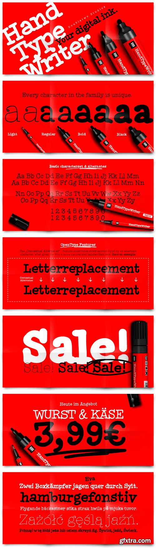
XXII HandTypeWriter Font Family
If you liked the XXII Marker you may like this small family too. The HandTypeWriter is, like the name might suggest, a playful handwritten typewriter font. And as already known from XXII Marker is this cool letter-replacing “Contextual Alternates” feature replacing every second glyph by an alternate character. This gives the HandTypeWriter a more natural and handwritten look. Just check it out.
OTF | 4 Fonts | JPEG Preview | 4.1 Mb RAR
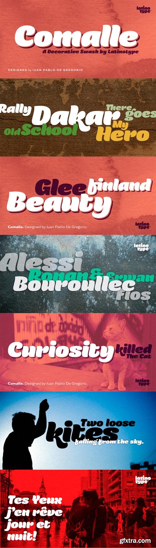
Comalle is an organic typeface that rescues some elements of handwritten script, but its stroke does not necessarily answer to a literal calligraphy structure. So Comalle could produce a powerful impact on the page, it was designed with thicker strokes than its counter forms. The objective is that the black of the letter fills the page and causes a fastest visual impact than typographies that balance blacks and whites. One of the most important tasks of the Comalle design was to think of how to handle the unequal percentages of blacks and whites in the typeface. The peculiar thing, is that the precision work of the letter does not make the blacks, but the whites; this is the reason why in one first instance it was very valid to start off designing in a very gross way, nevertheless, the majority energies are put in the details of the design of counter space. From the drained filling concept of forms Comalle was born, a typeface that pretends to enchant with its delicate counter space design and to impact with the heavy outlines which compose its form.
OTF | 1 Font | JPEG Preview | 4.3 Mb RAR
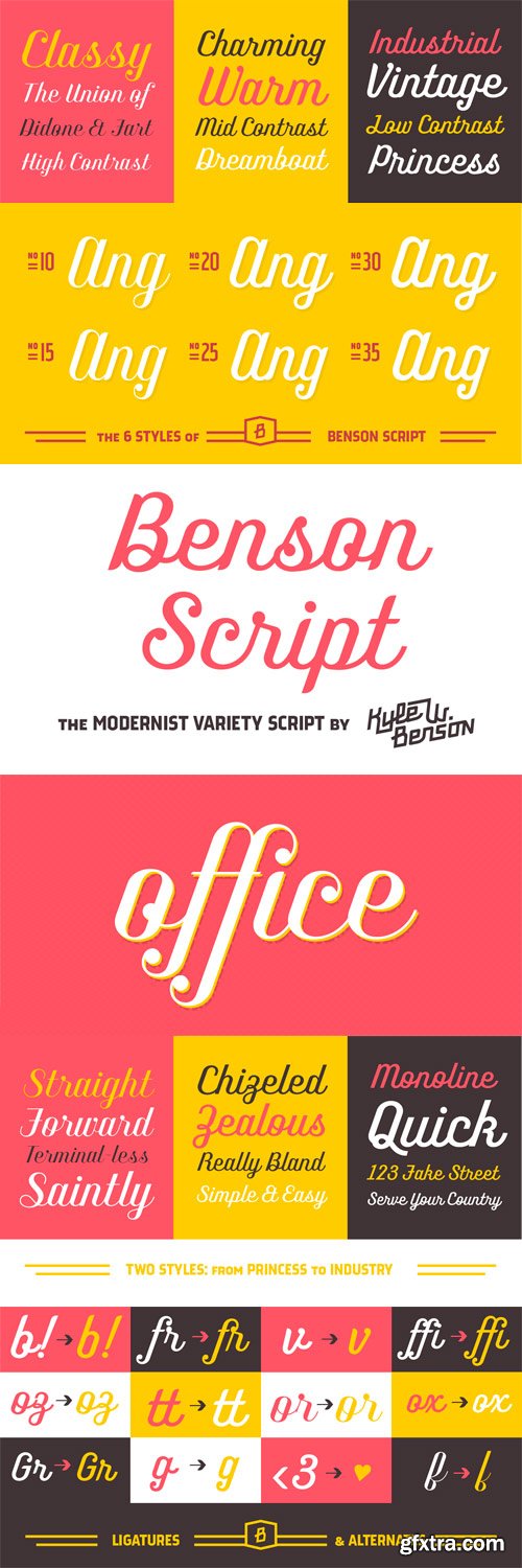
Benson Script is a script that is desperately trying to be anything but a script. With 3 contrast levels, and 2 styles, the six styles of Benson Script are an experiment in the diversity of a single stem width. Modernism’s desire to fit all elements within geometric constraints and adhere to strong verticals has spread throughout type design, but has had little to do with the frills and ornaments of script. Cutting a script down to its bare bones is an offensive idea to many—almost seeming insulting to its genre. Benson Script bridges that genre gap between frill and function. As a matter of genre Benson Script errs on the side of modernism, and adds flair as a last resort.
OTF | 6 Fonts | JPEG Preview | 4.8 Mb RAR
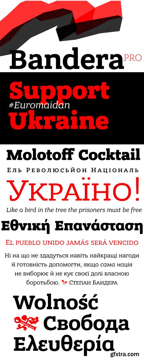
This square serif typeface is a real workhorse. It is a modern tool for text design: extremely legible, pan-european multilingual (Latin, Greek and Cyrillic), well shaped. Bandera Pro has six weights with original italics, alternatives, small capitals and three sets of digits. It catches attention in headlines of posters and magazines or makes reading comfortable in plain texts. Bandera Pro shares main proportions with sans serif Osnova Pro typefamily so ideally can pair it.
OTF | 12 Fonts | JPEG Preview | 4.8 Mb RAR
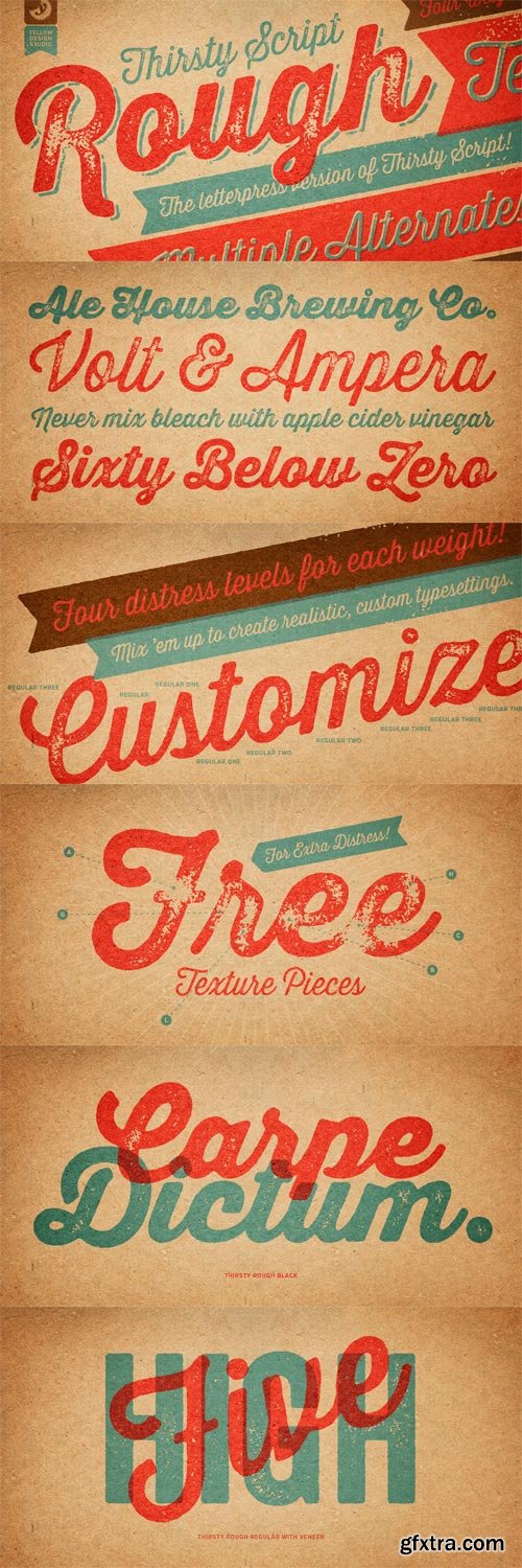
Thirsty Script Rough from Yellow Design Studio is the warm and weathered version of Thirsty Script with texture that captures the authentic qualities of letterpress printing. It’s highly customizable with four alternate versions of every weight ranging from very light to heavy distress. Because it’s remarkably detailed, it looks great even at large sizes. For extra customization and fun, it includes a set of matching texture pieces.
OTF | 21 Fonts | JPEG Preview | 30.7 Mb RAR
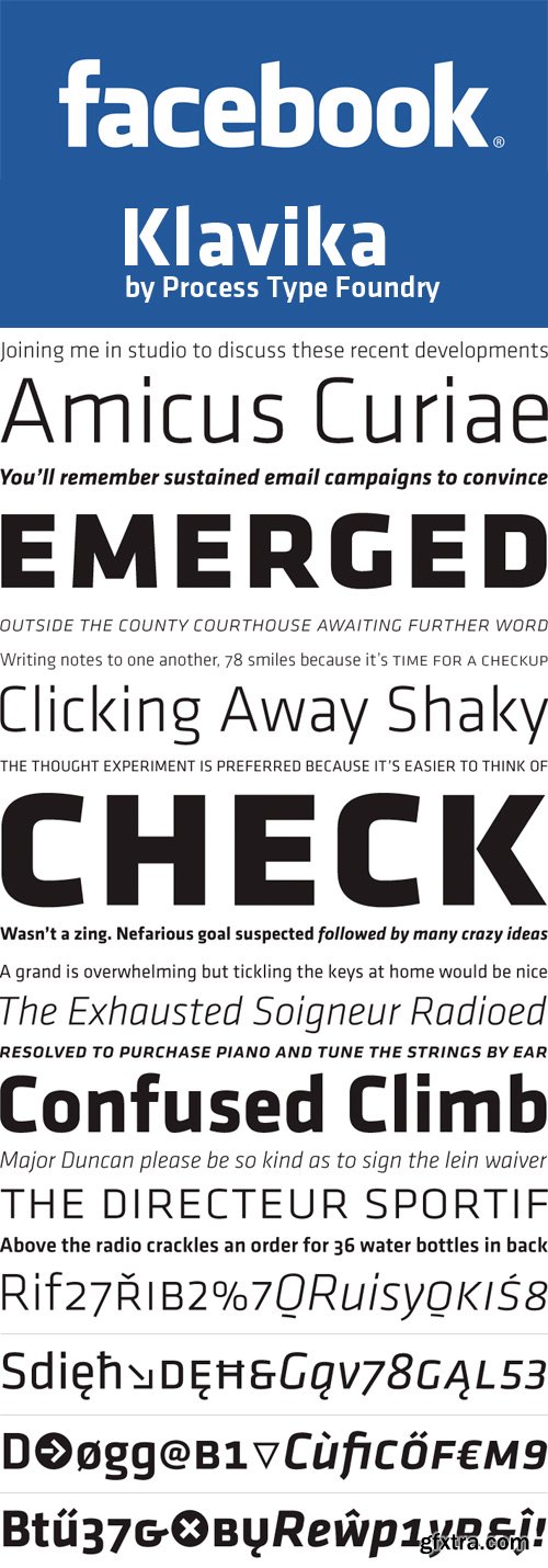
Klavika is a flexible family of sans serifs for editorial and identity design. Features such as small caps, true italics, extended language support and multiple numeral styles make Klavika an ideal workhorse typeface. It is also popular for its use of Facebook’s main logo.
OTF | 8 Fonts | JPEG Preview | 6.8 Mb RAR
SermonBox - Seasonal Collection

SermonBox - The Series Pack Collection

Top Rated News


Would you like to be a Author?